Warwickshire Mortgages
Warwickshire Mortgages was born from a desire to do things differently. Founded by Krystle Ward after years in corporate finance, the brand exists to provide honest, expert mortgage guidance in a sector often perceived as transactional and impersonal. Krystle’s vision was to create a business that puts people first — supporting clients through the mortgage journey with care, clarity, and expert guidance.
In a traditionally male-led, number-focused industry, Warwickshire Mortgages offers a fresh approach: compassionate, personalised advice that sees the person behind the paperwork. Every design choice reflects this mission, creating a visual identity that conveys warmth, trust, and professional expertise.
WHAT WE COLLABORATED ON:
- Brand Strategy
- Brand Vision & Direction
- Brand Identity Design
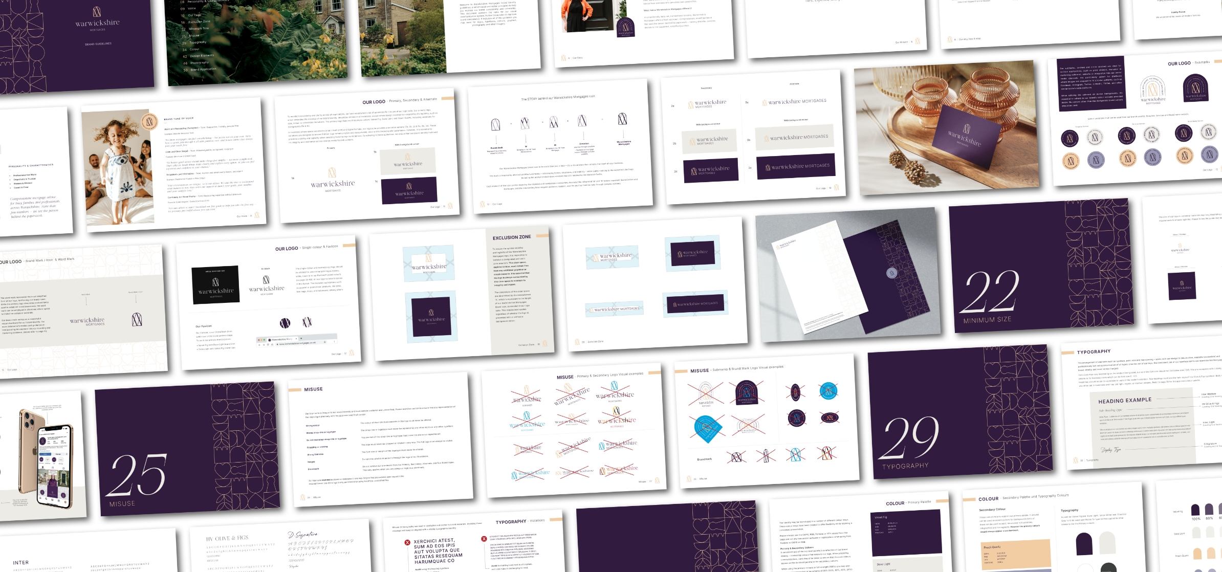
- Brand Guidelines
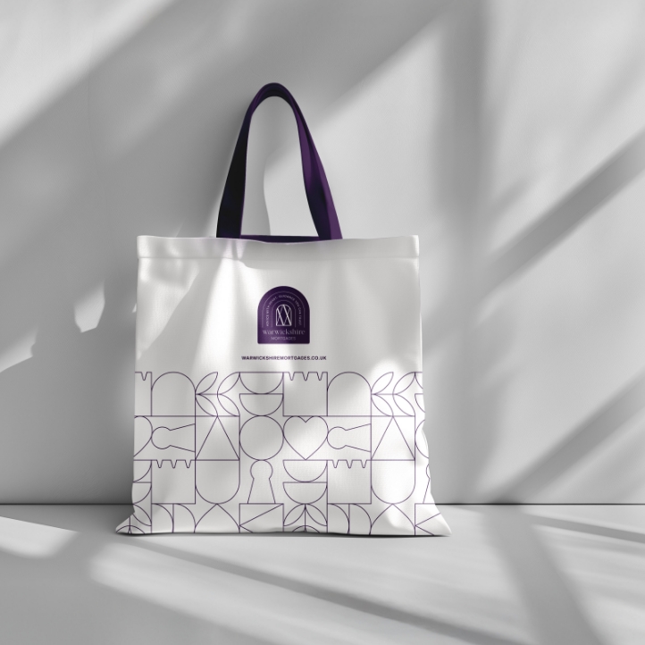
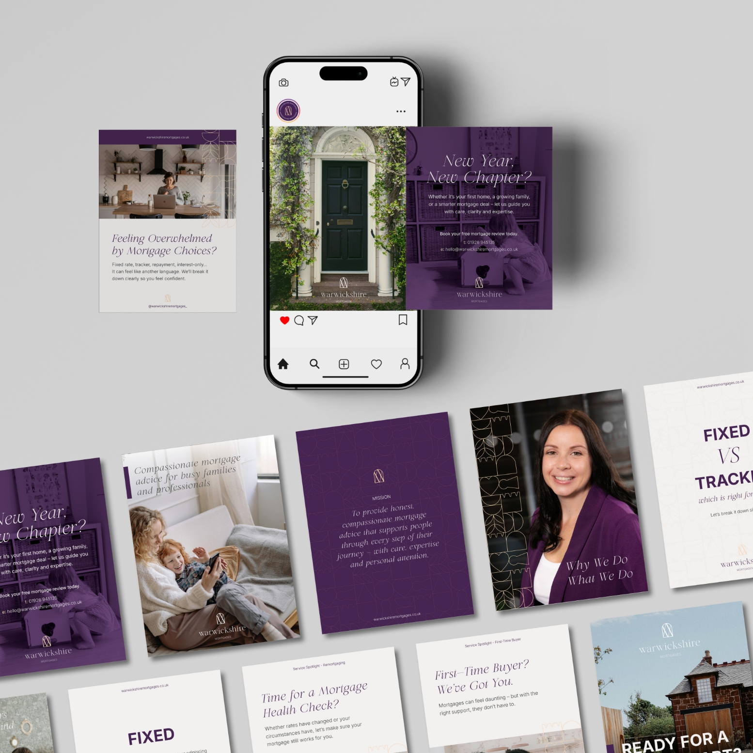
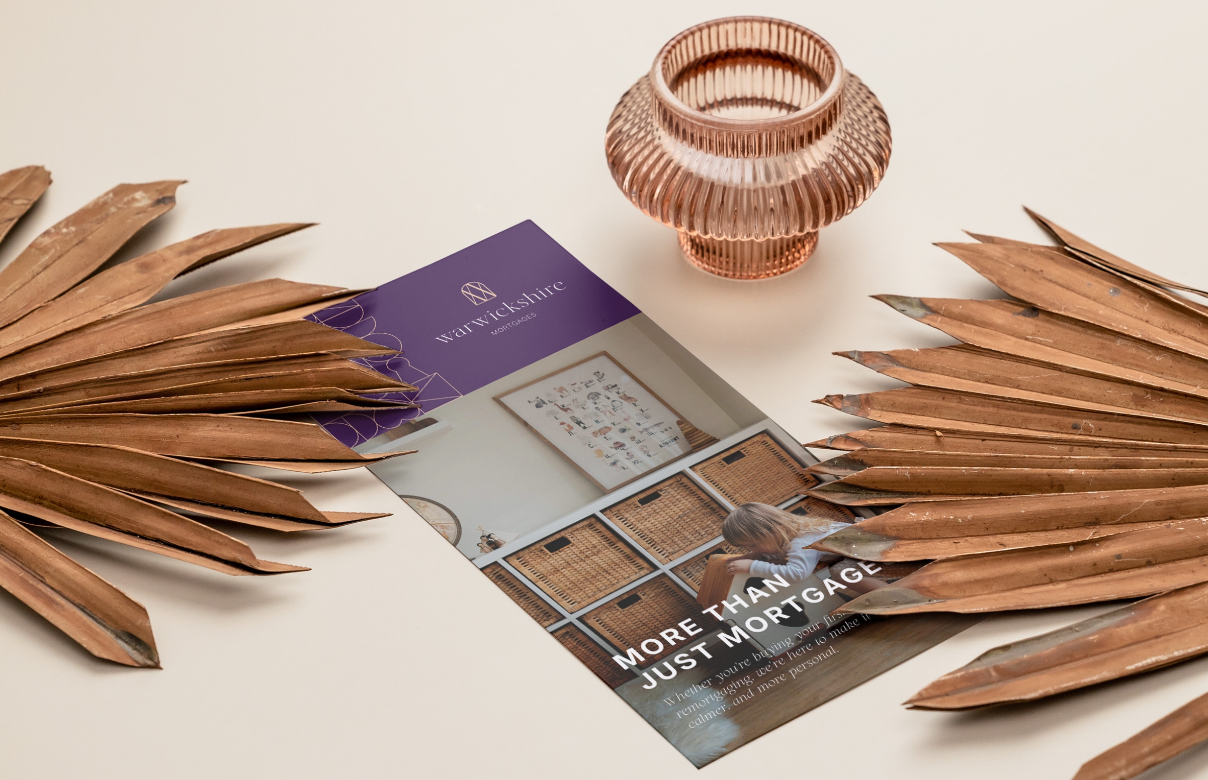
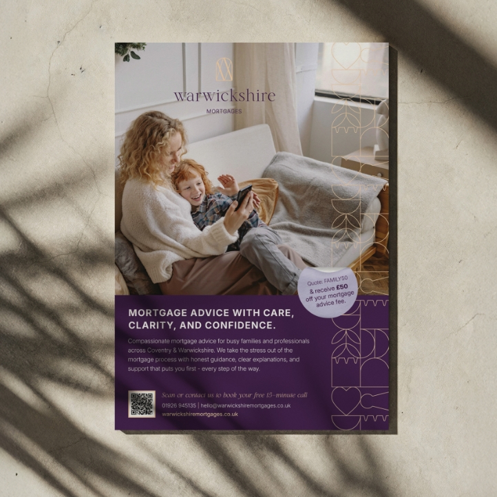
- Flyers & Marketing Collateral
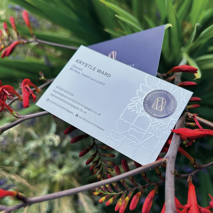
- Business Cards
- Social Media Graphic Templates
- Magazine Advert Design
- Branded Editable PDFs & Word Files
- Exhibition Pull-up Banner
- Print Design
- Print Management
The Challenge & Design Approach
Krystle wanted a brand that felt compassionate and approachable while still communicating professionalism and expertise. The goal was to create a visual identity that would appeal to busy families and professionals, giving them confidence in a complex, often stressful process.
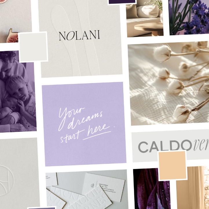
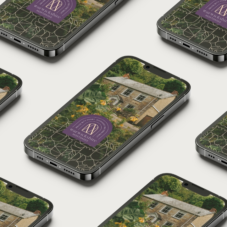
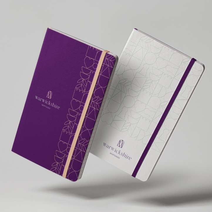
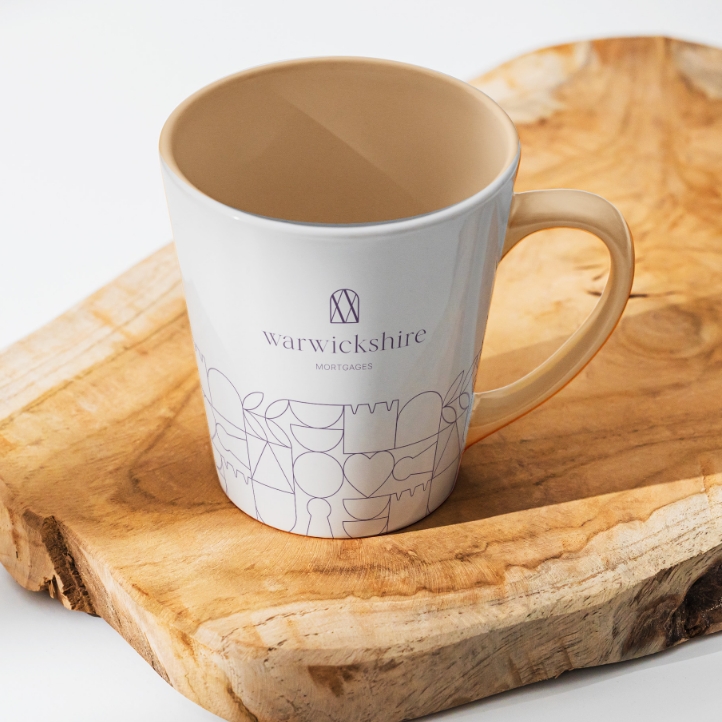
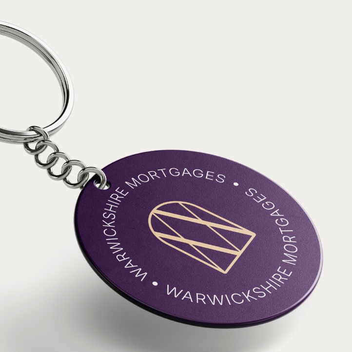
To achieve this, I developed a refined colour palette featuring Velvet Fig, Peach Quartz, Dove Light, and Lilac Dust — a warm, calm, and reassuring combination that distinguishes Warwickshire Mortgages from the typical blue-heavy financial sector. Velvet Fig communicates authority and expertise, Peach Quartz brings a human touch, Dove Light adds calmness, and Lilac Dust introduces subtle elegance. Together, they create a balanced, inviting, and modern look that speaks to Warwickshire Mortgages’ people-first ethos.
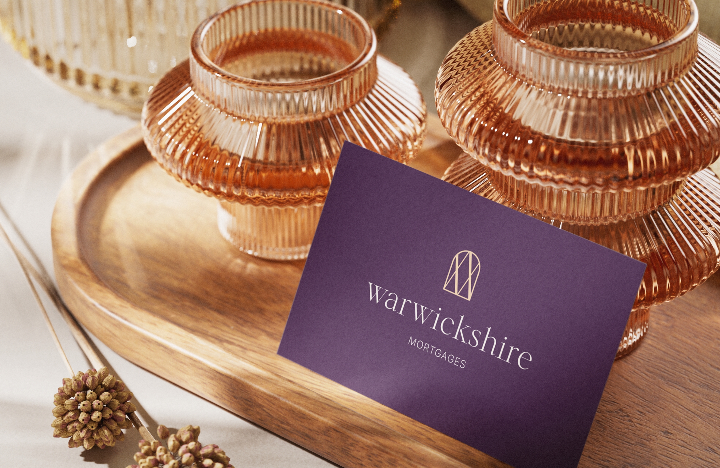
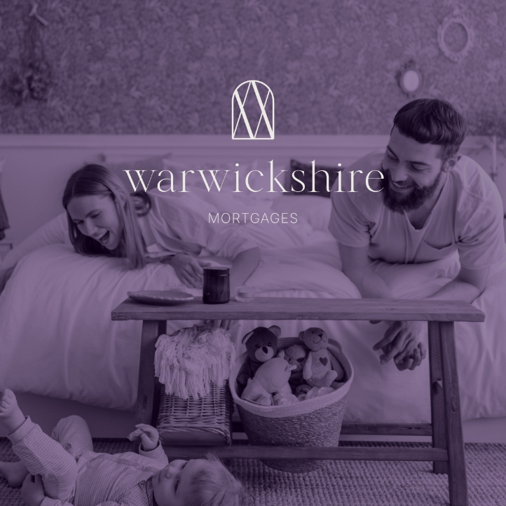
The logo uses an elegant serif for “Warwickshire” with softened bespoke edges to create a warm, approachable feel, paired with a clean, structured sans serif for “Mortgages” to maintain clarity and modernity. This combination balances authority with empathy, reflecting the brand’s dual commitment to expertise and care.
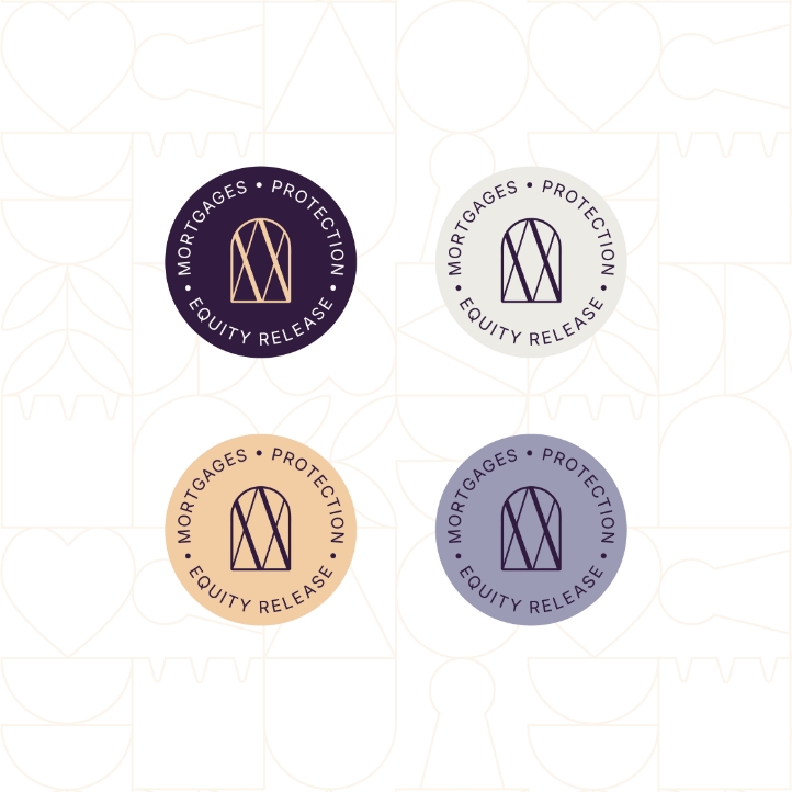
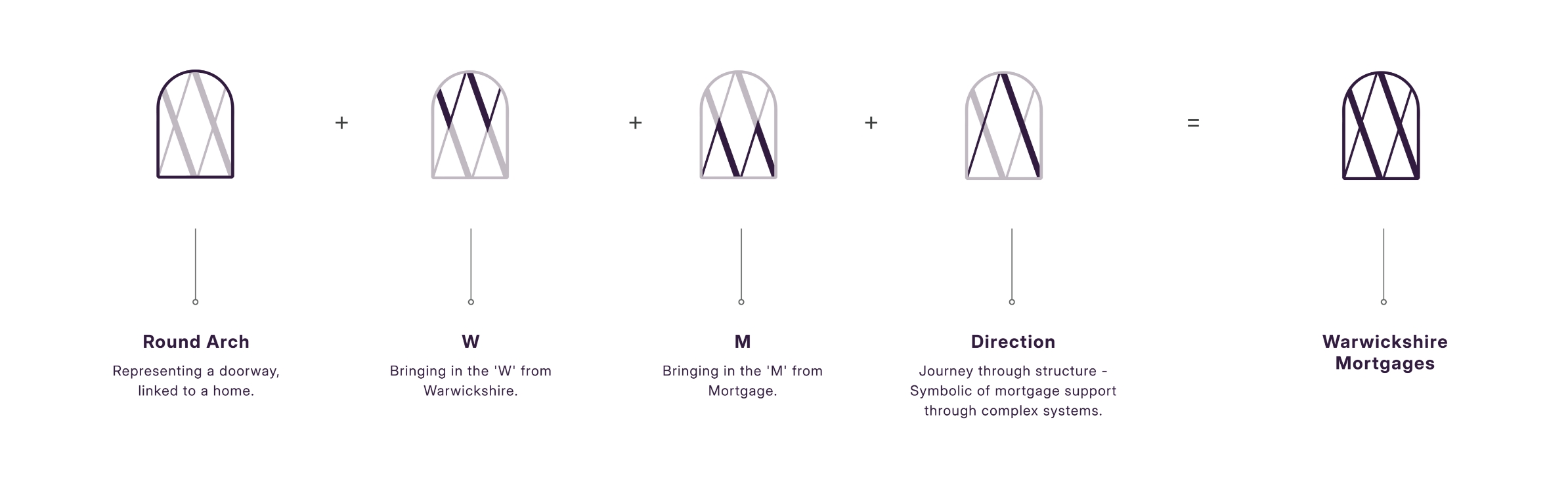
The brand icon was designed as a meaningful visual story. Inspired by architectural forms, Warwickshire’s heritage, and the home-buying journey, it incorporates a rounded arch (doorway), integrated ‘W’ and ‘M’ letters, and directional intersecting lines symbolising support and guidance.
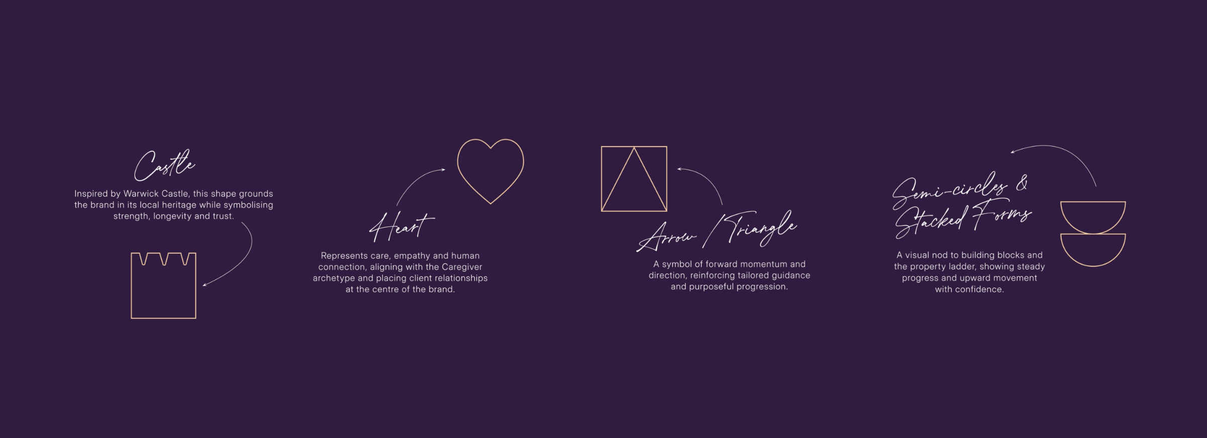
Complemented by a bespoke brand pattern which echo’s the icon’s architectural references with shapes drawn from castles, keyholes, arrows, and growth motifs, reinforcing the brand’s local roots while visually narrating the emotional journey from heart to home. These elements bring cohesion, reinforces clarity, confidence and support across stationery, signage, social assets, and internal documents for Krystle’s business.
Outcome
Warwickshire Mortgages launched with a clear, confident and emotionally resonant brand identity that positions the business as a trusted, people-first alternative within the mortgage industry. The new brand transforms a traditionally corporate, transactional service into a warm, refined and human-centred experience.
The identity successfully differentiates Krystle in a male-led, number-focused market, allowing her to communicate both professional expertise and genuine compassion. Through a cohesive and considered visual system, Warwickshire Mortgages now shows up with clarity, consistency and confidence across every touchpoint — from digital and print to exhibitions and client communications.
The result is a premium, memorable brand presence that builds trust, reassures clients, and supports long-term relationships with busy families and professionals seeking expert guidance delivered with care.
Krystle Ward - Director, Warwickshire Mortgages
Terri has done an incredible job of branding my business. From the initial consultation to the final result Terri had a really friendly collaborative approach which meant it was a really great project to work on. Her design skills are fabulous. I absolutely love my branding- a suite of logos, a brand pattern, typography, everything you can think of. My customers love it too. Thank you so much Terri for your hard work and creative skills. I would recommend Terri to anyone wanting branding for their business.

Ready to elevate your vision, attract leads, and boost sales?
Let’s set up a time to chat and explore how we can bring your project to life. We can’t wait to hear about your ideas and help you create a lasting impression with your audience.
Hey, let’s be friends
Want to be the first to know about exclusive news, freebies, creative business tips and personal thoughts surrounding all things design?
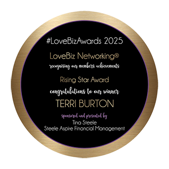
Awards & Featured